Welcome to TradingExpert Pro 9.32 upgrade site.
TradingExpert Pro 9.32 is an interim upgrade to 9.3 adding the following change
Option symbology changes to reflect Options Industry Council new format
The OIC symbol format changes provide a common sense method for option ticker symbols. Several format styles were recommended. AIQ has adopted the following compliant format for options symbols:
| Underlying ticker symbol |
Month/Year |
Strike |
Call/Put |
| XYZ |
May10 |
170 |
C |
For example the Goldman Sachs [GS] May 10 170 call symbol is GS May10 170 C
AIQ Charts real-time, AIQ RTAlerts and AIQ Quotes Barometer will accept the new symbol format. The first screen shot below shows AIQ Quotes/Barometer with several option tickers in the new format, the second screen shot shows the same tickers in AIQ RTAlerts.


This upgrade is for clients of the TradingExpert Pro on the monthly lease plan, all other TradingExpert or TradingExpert Pro clients please contact AIQ at 1-800-332-2999 for details. If you are not on the monthly plan and install the upgrade your key number may be invalidated.
If you are also a client of AIQ OptionExpert, please click here for the OptionExpert 9.32 upgrade.
TradingExpert Pro 9.3 features
Compatibility with Windows Vista 64 bit and Comparison Charts
Enhancements
Charts
- Comparison Charts
The Comparison Charts allow you to compare multiple charts of any ticker in a percentage change format. Tickers can be entered through the regular Chart Ticker function, separated by a semicolon, or using the Explore List feature in the control panel. You can also add or remove tickers while in Explore List view.
There are six time frames available in Comparison Charts YTD, 1 MO, 3 MOS, 6 MOS, 1 YR, 2 YR. Each ticker in a Comparison Chart is automatically assigned an independent color depending on your background color.
The Charts below provide some examples of how to use this tool.
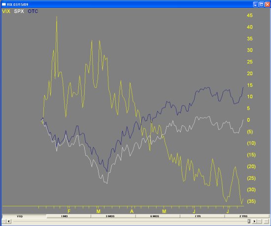
The first Comparison Chart shows a YTD percentage change comparison Of the SP500 [SPX], Nasdaq Composite [OTC] and the Volatility Index [VIX]. The dramatic drop in the VIX as the markets have risen from the March lows is clearly shown. The more volatile Nasdaq index can also be seen outperforming the SP500.
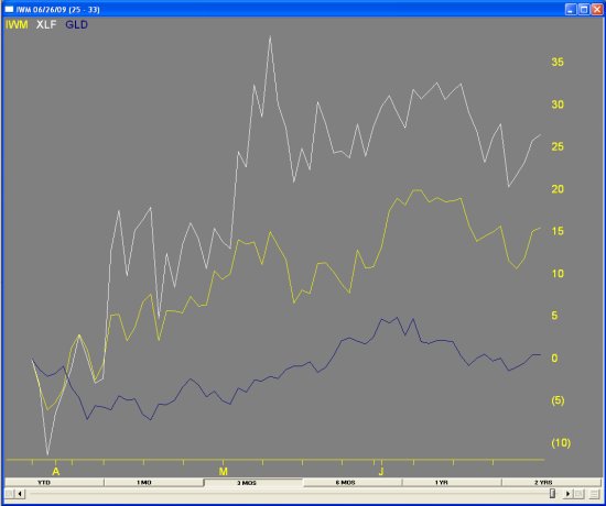
The second Comparison Chart shows a 3 MO percentage change comparison of the iShares Russell 2000 [IWM], SPDR Financials [XLF], and Street Tracks Gold [GLD]. The strong performance of the SPDR Financials vs the iShares Russell 2000 is clearly displayed. The less stellar comparative performance of Street Tracks Gold is the blue.
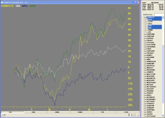
The third Comparison Chart shows a YTD percentage change comparison of The S&P500 Computer Group [COMPUTE] with 3 stocks from that group, IBM [IBM], Hewlett [HPQ] and Apple [AAPL]. The strong performance by AAPL vs IBM and HPQ has helped this group's gains over the last year.
64-bit compatability.The 9.3 version is now compatible with the Vista 64-bit operating system.
|
|
